Adding UI Elements
- Charles Evans (Deactivated)
e Form Structure panel of the developer workbench is a visual representation of the controls that make up your application's user interface. The Project node is the root node under which multiple pages, scripts, and models can be added. In new applications, a Page is automatically added along with a Form, Form Container and Form Element.
If the app you are building is an entry-type form, you can start adding new UI elements directly to the existing app by right-clicking a node in the Form Structure and selecting from one of the provided options. Depending on the selected node, the right-click menu may provide you with different options of what controls can be added. This is due to the fact that some controls have restrictions on the parent control in which they are placed. For example, you may not add an Input control directly under a Form or Form Container, you can only add it under the Form Element.
Take a look at the video below which shows how to set up a basic form from a newly created application.
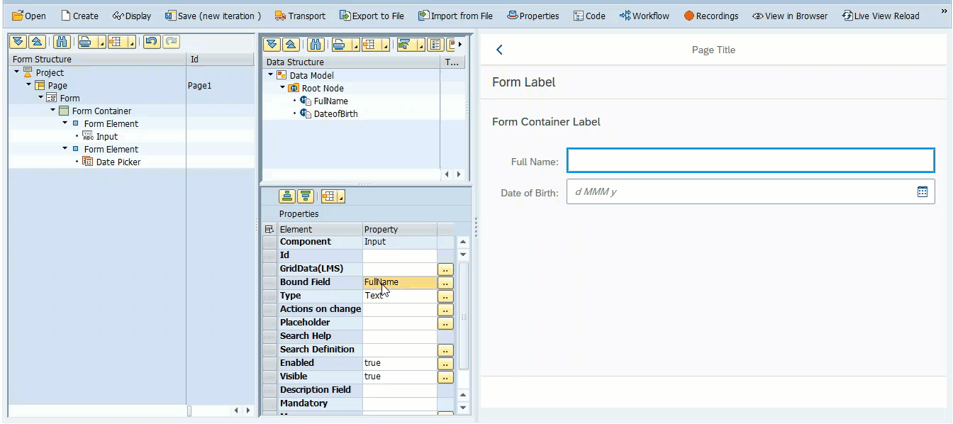
The video also shows how to bind various controls to your data model using the Bound Field property. When adding a new control that accepts user input, the Bound Field property informs the application which field in the Data Model to use for storage. Newly created data elements automatically create new fields in the data model.
You can use the search help to find an existing field in the data model to bind the control to, or you can type in a new field name which will automatically add that field to your data model.
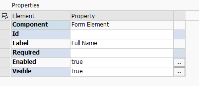
Once you have added a new control to your form structure, the next step is to configure that control through the Properties section. After clicking on the control in the Form Structure section, the available properties for that control will appear in the Properties grid. As shown in the video, changing the text of a Form Element is as simple as changing the value of the Label property.
A useful property exposed by some controls is GridData(LMS). Behind the scenes, this is creating a sap.ui.layout.GridData element which will control the size of the control based on the device (Desktop, Tablet, Phone) on which the app is being displayed. Fiori applications use a 12 column layout and each of the controls can be configured to take up a certain number of these columns based on the size of the device.
e.g. Setting L4M6S12 for the GridData(LMS) property is instructing the app to use 4 columns when the viewing size is Large, 6 columns when Medium and the full 12 columns when Small.
For more information on the available controls and their associated properties, please visit the Control Reference page.
Related articles