Form
- Charles Evans (Unlicensed)
A Form object is used to group major sections of input fields together. It is usually used for sections of input that are logically related and which possibly may be hidden or shown depending on the state of the workflow.
Note: we often refer to the App or Project as a whole as a "Form" because from the user's point of view, they are filling out a "Form". But technically the Form is one distinct SAP UI5 element used to group and layout fields for input.
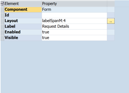
A Form can have it's own label, for example "Request Details"
A Form can consist of one or more Form Containers. In the example below is a form with two Form Containers.
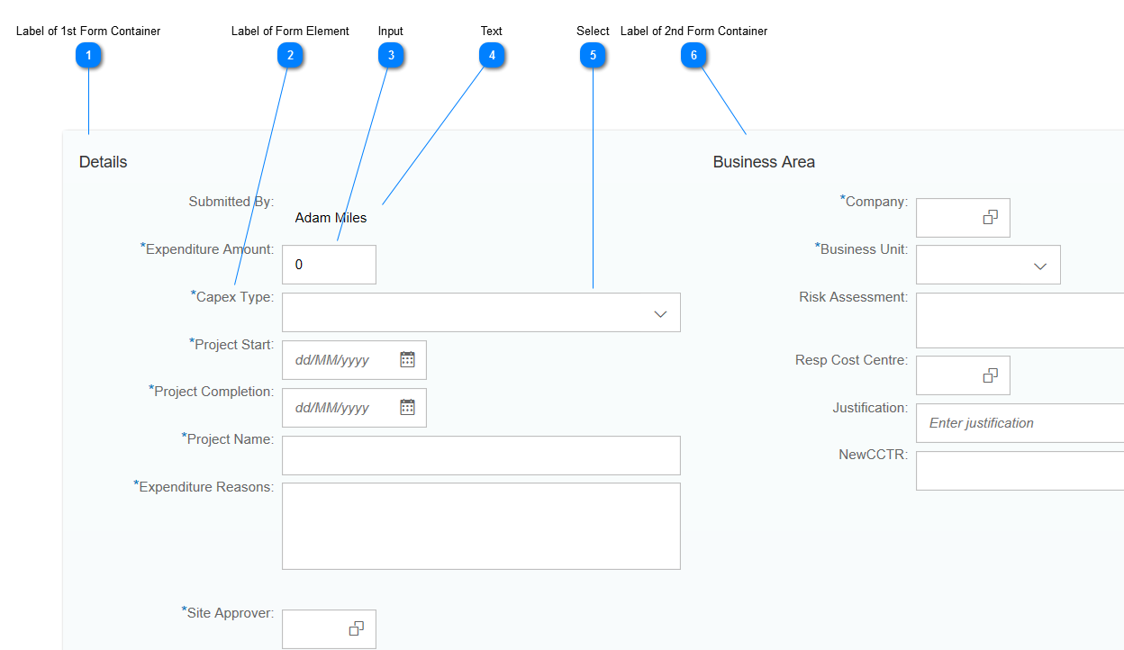
Layout of Form
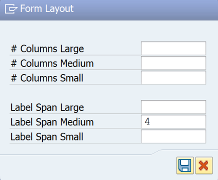
The Layout of a Form can be set. Layout controls how many Columns are used when the screen is Large, Medium or Small. Each Column is occupied by one Form Container.
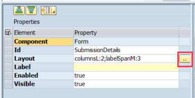
Edit the Layout by clicking the button (...) adjacent to the Layout property of the Form.
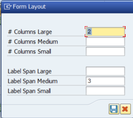
Column Span
The width of Labels within a Form can be controlled by setting the Column Span properties of the Form.
Sometimes Form Element Labels may be too long to be displayed without getting cut off. It is possible to control the width of these Labels using the Column Span settings.
Fiori App Builder generally uses a grid layout. The screen has 12 imaginary columns in this grid. If the Label Span is set to say 4, then 4 columns of the grid are taken up by the Label, leaving 8 columns remaining for other content such as input elements.
For example, notice below that when the screen is large, the full label is visible.
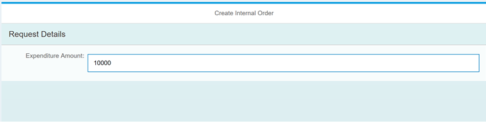
When the screen is resized, the label may eventually be cut off.
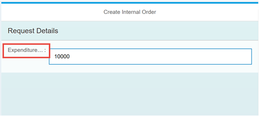
By changing the LabelSpanM (label span when screen is 'medium' sized) property so that the label now takes up 4 columns, the label is fully visible again.
Form Wizard
A Form Wizard is available that draws on an existing ABAP screen and uses the fields you select to generate a screen layout.
How to add a Form: Step-by-step guide
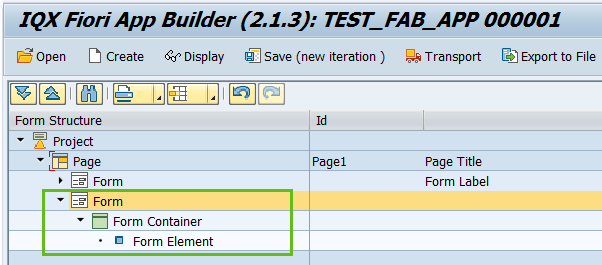
Select the Page by clicking on the Page in the Project Structure.
- Right click on the Page component and select Add Form.
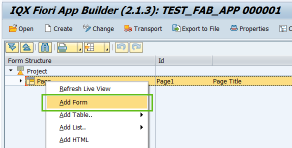
- The second Form is now available to use. Take note that by creating a Form, a default Form Container and Form Element will be created as well.
- Adjust the layout and labels as needed. Save the project.
Related articles