/
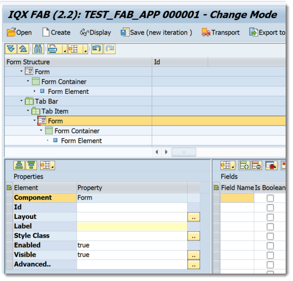
Tab Bar
Tab Bar
- Charles Evans (Unlicensed)
Owned by Charles Evans (Unlicensed)
Jul 03, 2020
Analytics
Loading data...
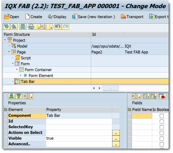
Properties of Tab Bar
- Id - unique identifier of the control
- Selected Key - sets the default tab to be accessed. The value is from the Tab Item property "Key"
- Actions on Select - executes the javascript function assigned for this event
- Visible - set a boolean value or a variable with type boolean from the Model to control the visibility property
Advanced - properties of the control not available in the above list can be added here.
Setting Additional Properties provides further information about the Advanced property
Tab Items are needed for the Tab Bar to function completely
Properties of Tab Item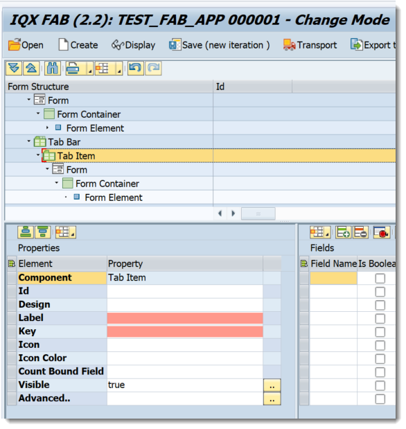
- Id - unique identifier of the control
- Design - Specifies whether the icon and the texts are placed vertically or horizontally sap.m.IconTabFilterDesign
- Label - tab text
- Key - unique key of the tab
- Icon - icon to be displayed in the tab
- Icon Color - specifies the icon color
- Count Bound Field - Represents the "count" text, which is displayed in the tab filter
- Visible - set a boolean value or a variable with type boolean from the Model to control the visibility property
Advanced - properties of the control not available in the above list can be added here.
Setting Additional Properties provides further information about the Advanced property
Step-by-step guide
How to add a Tab Bar
- Right click on a Page or from any elements under Add Layout and select Add Other-→ Add Tab Bar
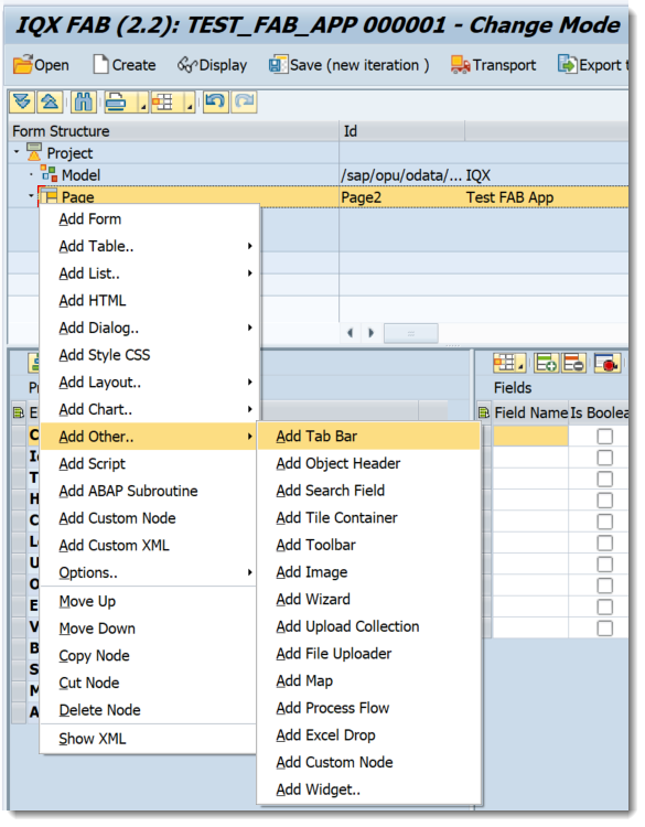
- A Tab Bar Control has been added
- Right click on the Tab Bar and select Add Tab Item
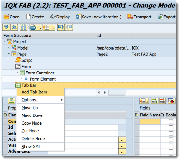
Right click on the created Tab Item and select the relevant controls - Controls within the Tab Item have been created
Related articles