2.2.1 Page
The Page is the container of the App's screen. FAB provides the header, content (body) and footer areas by default.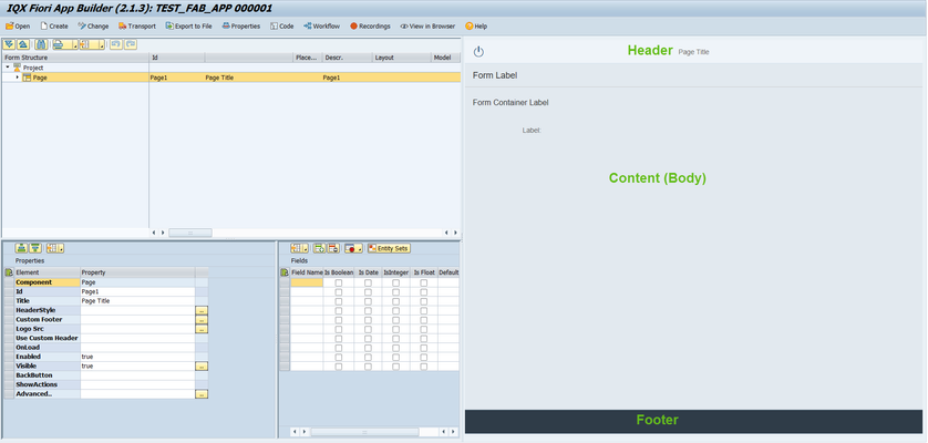
The page has the following properties:
- Id - unique identifier of the control
- Title - Text that will be displayed at the center of the Header area
- Header style - CSS properties can be defined here (e.g. background:#8ac43f)
- Custom footer - implement custom footer definition
Sample implementation of adding 2 buttons in the footer
<Toolbar class="x-colophon">
<ToolbarSpacer/>
<Button text="Use vendor details" enabled="true"
visible="true" type="Emphasized" press="executeFunction" cdata:function="goToInvoiceSearch(evt)"
icon="sap-icon://visits"/>
<Button text="Create New Vendor" enabled="true"
visible="true" type="Emphasized" press="executeFunction" cdata:function="AddNewVendor(evt)"
icon="sap-icon://sys-add"/>
</Toolbar> Logo src - image to be displayed in the right part of the Header area.
Add Logo to a FAB Form describes this in detail
- Use custom header - similar to Custom footer, a header definition can be implemented here
- OnLoad - a JavaScript function can be set here which will be called on the initial load of the Page. Typical use of this is for initialization of values.
Additional Page Events that can be assigned with Javascript functions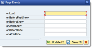
- Enabled - set a boolean value or a variable with type boolean from the Model to control the enable property
- Visible - set a boolean value or a variable with type boolean from the Model to control the visibility property
- BackButton - toggles to show either logout and back button
- ShowActions - show/hide the footer and action buttons
- More... - opens up the More Properties Dialog Screen
Advanced - properties of the control not available in the above list can be added here.
Setting Additional Properties provides further information about the Advanced property.
More Properties Dialog Screen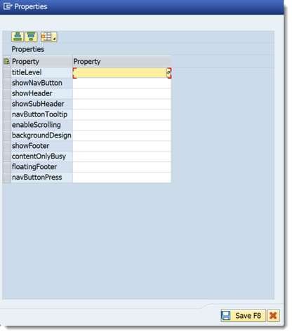
- titleLevel - choose from the available options from sap.ui.core.TitleLevel. Leaving it blank will set it to value Auto as a default.
- showNavButton - A nav button will be rendered on the left area of header bar if this property is set to true. Set a boolean value or a variable with type boolean from the Model to control the showNavButton property
- showHeader - set a boolean value or a variable with type boolean from the Model to control the showHeader property
- showSubHeader - set a boolean value or a variable with type boolean from the Model to control the showSubHeader property
- navButtonTooltip - tooltip of the NavButton
- enableScrolling - set a boolean value or a variable with type boolean from the Model to control the enableScrolling property
- backgroundDesign - set a background color by choosing the values from sap.m.PageBackgroundDesign
- showFooter - set a boolean value or a variable with type boolean from the Model to control the showFooter property
- contentOnlyBusy - set a boolean value or a variable with type boolean from the Model to control the contentOnlyBusy property
- floatingFooter - set a boolean value or a variable with type boolean from the Model to control the floatingFooter property
- navButtonPress - this event is fired when Nav Button is pressed
Step-by-step guide
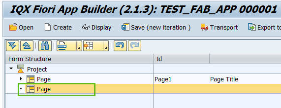
How to add a Page
- Select the Project by clicking on it in the Project Structure.
- Right click on the Project component and select Add Page.
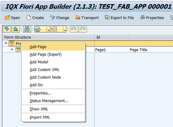
- The second Page is now available to use.
- Enter the properties as required
Related articles