Popover
Properties of List of Popover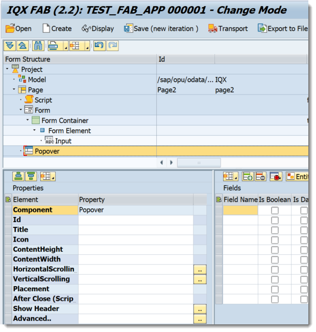
- Id - unique identifier of the control
- Title - the text that will be shown in the Dialog Header. This property will be ignored when showHeader is set to false.
- Icon -
- ContentHeight - height setting of the Dialog
- ContentWidth - width setting of the Dialog
- HorizontalScrolling - set a boolean value or a variable with type boolean from the Model to control the horizontalScrolling property
- VerticalScrolling - set a boolean value or a variable with type boolean from the Model to control the verticalScrolling property
- Placement - select the values from sap.m.PlacementType
- After Close (Script) -
- Show Header - set a boolean value or a variable with type boolean from the Model to control the showHeader property
Advanced - properties of the control not available in the above list can be added here.
Setting Additional Properties provides further information about the Advanced property
Step-by-step guide
How to add a Popover
- Right click on a Page and select Add Dialog-→ Popover
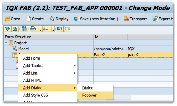
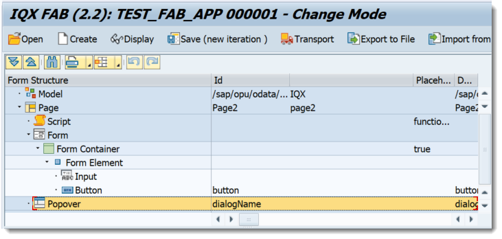
- A Popover Control has been added
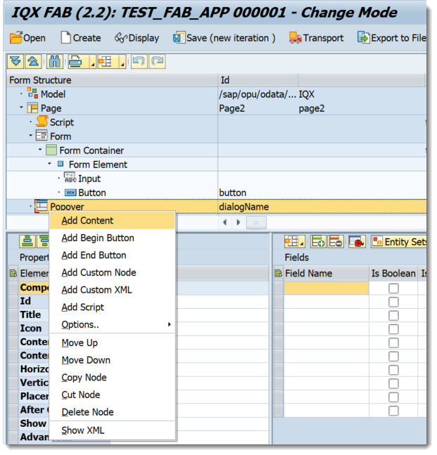
- Controls can be added by doing a Right click on the Popover
- The Popover Control can be accessed by using the FAB delivered JS function below
openPopover(popoverName, oControl)
opens a Responsive Popover with name 'popoverName'. The popover will emerge from oControl( eg Button)
Related articles
, multiple selections available, Use left or right arrow keys to navigate selected items