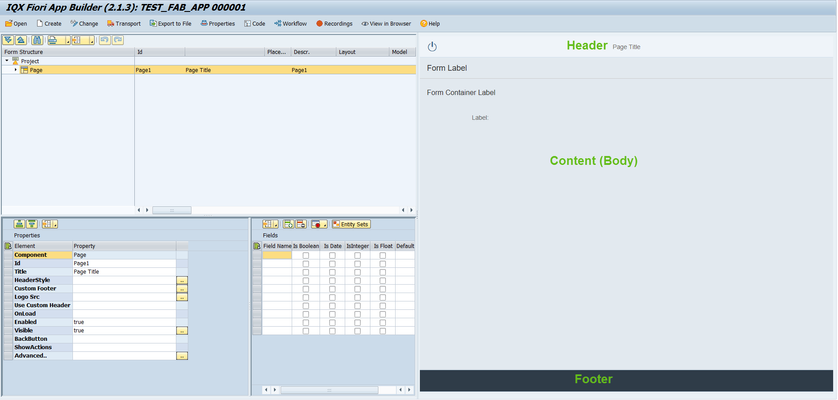
The Page is the container of the App's screen. FAB provides the header, content (body) and footer areas by default.
The page has the following properties:
- Id - unique identifier of the control
- Title - Text that will be displayed at the center of the Header area
- Header style - CSS properties can be defined here (e.g. background:#8ac43f)
- Custom footer - implement custom footer definition
Sample implementation of adding 2 buttons in the footer
<Toolbar class="x-colophon">
<ToolbarSpacer/>
<Button text="Use vendor details" enabled="true"
visible="true" type="Emphasized" press="executeFunction" cdata:function="goToInvoiceSearch(evt)"
icon="sap-icon://visits"/>
<Button text="Create New Vendor" enabled="true"
visible="true" type="Emphasized" press="executeFunction" cdata:function="AddNewVendor(evt)"
icon="sap-icon://sys-add"/>
</Toolbar> Logo src - image to be displayed in the right part of the Header area.
Add Logo to a FAB Form describes this in detail
- Use custom header - similar to Custom footer, a header definition can be implemented here
- OnLoad - a JavaScript function can be set here which will be called on the initial load of the Page. Typical use of this is for initialization of values.
- Enabled - set a boolean value or a variable with type boolean from the Model to control the enable property
- Visible - set a boolean value or a variable with type boolean from the Model to control the visibility property
- BackButton - toggles to show either logout and back button
- ShowActions - show/hide the footer and action buttons
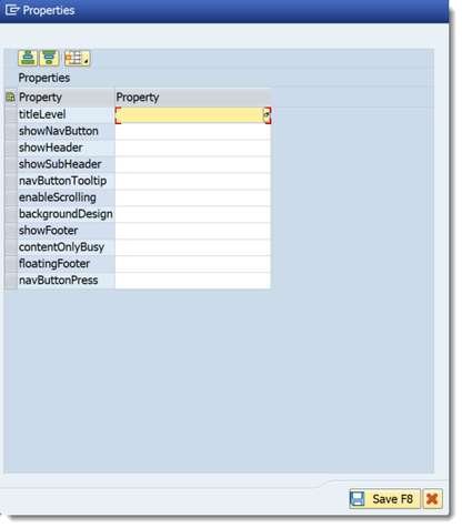
- More... - opens up the More Properties Dialog Screen
Advanced - properties of the control not available in the above list can be added here.
Setting Additional Properties provides further information about the Advanced property.
More Properties Dialog Screen
- titleLevel - choose from the available options from sap.ui.core.TitleLevel. Leaving it blank will set it to value Auto as a default.
- showNavButton - A nav button will be rendered on the left area of header bar if this property is set to true. Set a boolean value or a variable with type boolean from the Model to control the showNavButton property
- showHeader - set a boolean value or a variable with type boolean from the Model to control the showHeader property
- showSubHeader - set a boolean value or a variable with type boolean from the Model to control the showSubHeader property
- navButtonTooltip - tooltip of the NavButton
- enableScrolling - set a boolean value or a variable with type boolean from the Model to control the enableScrolling property
- backgroundDesign - set a background color by choosing the values from sap.m.PageBackgroundDesign
- showFooter - set a boolean value or a variable with type boolean from the Model to control the showFooter property
- contentOnlyBusy - set a boolean value or a variable with type boolean from the Model to control the contentOnlyBusy property
- floatingFooter - set a boolean value or a variable with type boolean from the Model to control the floatingFooter property
- navButtonPress - this event is fired when Nav Button is pressed
Step-by-step guide
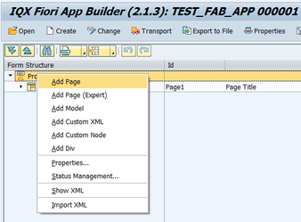
How to add a Page
- Select the Project by clicking on it in the Project Structure.
- Right click on the Project component and select Add Page.
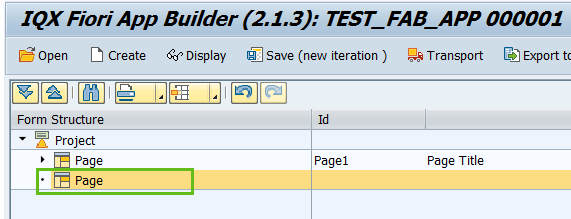
- The second Page is now available to use.
- Enter the properties as required
Related articles


Add Comment