A Vertical Layout is a general-purpose container which can be handy for grouping controls. They:
- do not affect the visual look of the app (unless you apply Styles to them).
- have the xmlns Property, which allows the definition of a namespace declaration (such as xmlns="sap.ui.unified"), which can be used by the children elements.
- are useful for grouping Controls which are to be included in a Widget.
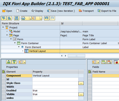
Properties of Vertical Layout
- Id - unique identifier of the control
- Style Class - assign a predefined SAPUI5 CSS or a CSS class defined in the CSS of the App
- Width - width setting
- Enabled - set a boolean value or a variable with type boolean from the Model to control the enable property
- Visible - set a boolean value or a variable with type boolean from the Model to control the visibility property
- xmlns - used to add an SAPUI5 namesapace. In the sample below, the namespace and controls under it can be accessed inside the Vertical Layout.
Step-by-step guide
How to add an Vertical Layout
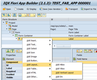
- Right click on a Page, Form Element or from any elements under Add Layout and select Add Vertical Layout
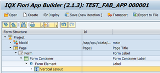
- An Vertical Layout control has been added
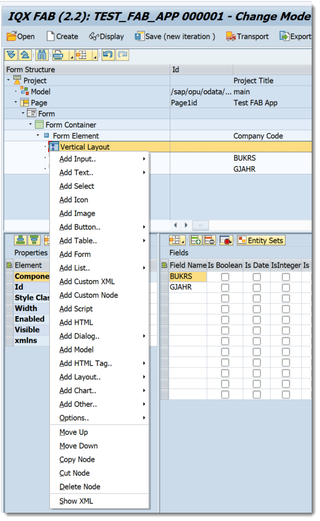
- UI Elements including Model can be added under the Vertical Layout Control by doing a Right click from it
Related articles


Add Comment