The Page control is used as the container of the application screen components. It has three sections namely the Header, Content (Body), and Footer.
Properties
Element | Usage | |||||
|---|---|---|---|---|---|---|
ID | Unique identifier of the control | |||||
Title | Title of the header | |||||
HeaderStyle | Defines the CSS style of the control | |||||
Custom Footer | Implements a custom footer content Sample implementation of adding 2 buttons in the footer
| |||||
Logo Src | Defines the source of the header logo | |||||
Use Custom Header | Defines whether the user can use a custom header or not Set the value to | |||||
OnLoad | Defines the actions that will be executed OnLoad event by calling the related JavaScript function Select the ellipsis to implement JavaScript functions on other events: onBeforeFirstShow | |||||
Enabled | Defines whether the user can interact with the control or not Set the value to | |||||
Visible | Defines whether the control should be visible on the screen or not Set the value to | |||||
BackButton | Defines whether the logout and the back buttons should be displayed on the screen or not Set the value to | |||||
ShowActions | Defines whether the footer and the action buttons should be displayed on the screen or not Set the value to | |||||
More | Contains all the other control properties | |||||
titleLevel | Choose from the available options from sap.ui.core.TitleLevel. Default value is Auto. | |||||
showNavButton | Defines whether the navigation button should be visible on the screen or not Set the value to | |||||
showHeader | Defines whether the header should be visible on the screen or not Set the value to | |||||
showSubHeader | Defines whether the sub header should be visible on the screen or not Set the value to | |||||
navButtonTooltip | Tooltip of the NavButton | |||||
enableScrolling | Defines whether the scrolling is enabled or not Set the value to | |||||
backgroundDesign | Sets a background colour by choosing the values from sap.m.PageBackgroundDesign | |||||
showFooter | Defines whether the footer should be visible on the screen or not Set the value to | |||||
contentOnlyBusy | Defines whether only the content area is covered by the local BusyIndicator or not Set the value to | |||||
floatingFooter | Defines whether the floating footer should be visible on the screen or not Set the value to | |||||
navButtonPress | Defines the actions that will be executed on navButtonPress event by calling the related JavaScript function | |||||
Advanced | Properties of the control that are not available in the element list can be added in the advanced Detail Editor For more information, you may refer to Setting Additional Properties of a Control |
Components
The Page consists of several application screen components called controls which can be added by right clicking on the Page. See Controls for more information.
Step-by-step guide
How to add a Page
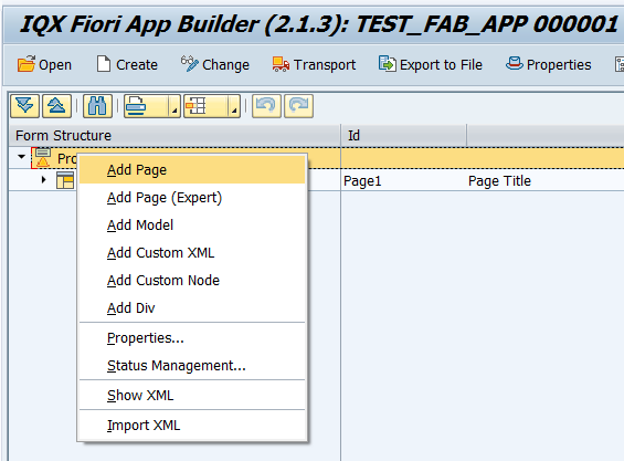
Select the Project by clicking on it in the Project Structure.
Right click on the Project component and select Add Page.
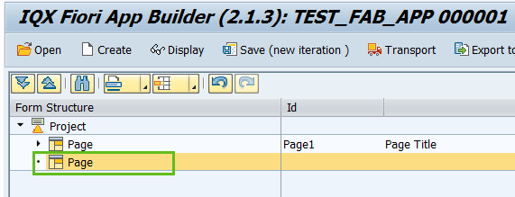
The second Page is now available to use.
Enter the properties as required
Related articles
| Filter by label (Content by label) | ||||||||||||||||
|---|---|---|---|---|---|---|---|---|---|---|---|---|---|---|---|---|
|
...